
Last Updated: 8/2/2016 1 of 5
PowerBI Report Users Guide
PowerBI allows you to gain meaning from data through multiple types of interaction.
Sign In to PowerBI
Go to www.powerbi.com and click Sign In. Type in your @ksu.edu email address. The
page will redirect you to the K-State eID sign in page. Sign in with your regular eID and
password. You will then be redirected to PowerBI.
Use a Dashboard in PowerBI
The first view you will see is the dashboard view, which is meant to show data highlights.
You can select different dashboards using the navigation pane on the left.
Clicking on a dashboard tile will take you to a detailed interactive report related to the
topic in the tile.
You can also view a dashboard in full-screen mode and print the dashboard for further
viewing options.
Navigate a Report in PowerBI
Use the buttons at the bottom of a report to navigate between pages. You can also
view a report full-screen and save/print a screenshot of the report using the print
option.
Additional interaction options are detailed on the following pages.
Last Updated: 8/2/2016 2 of 5
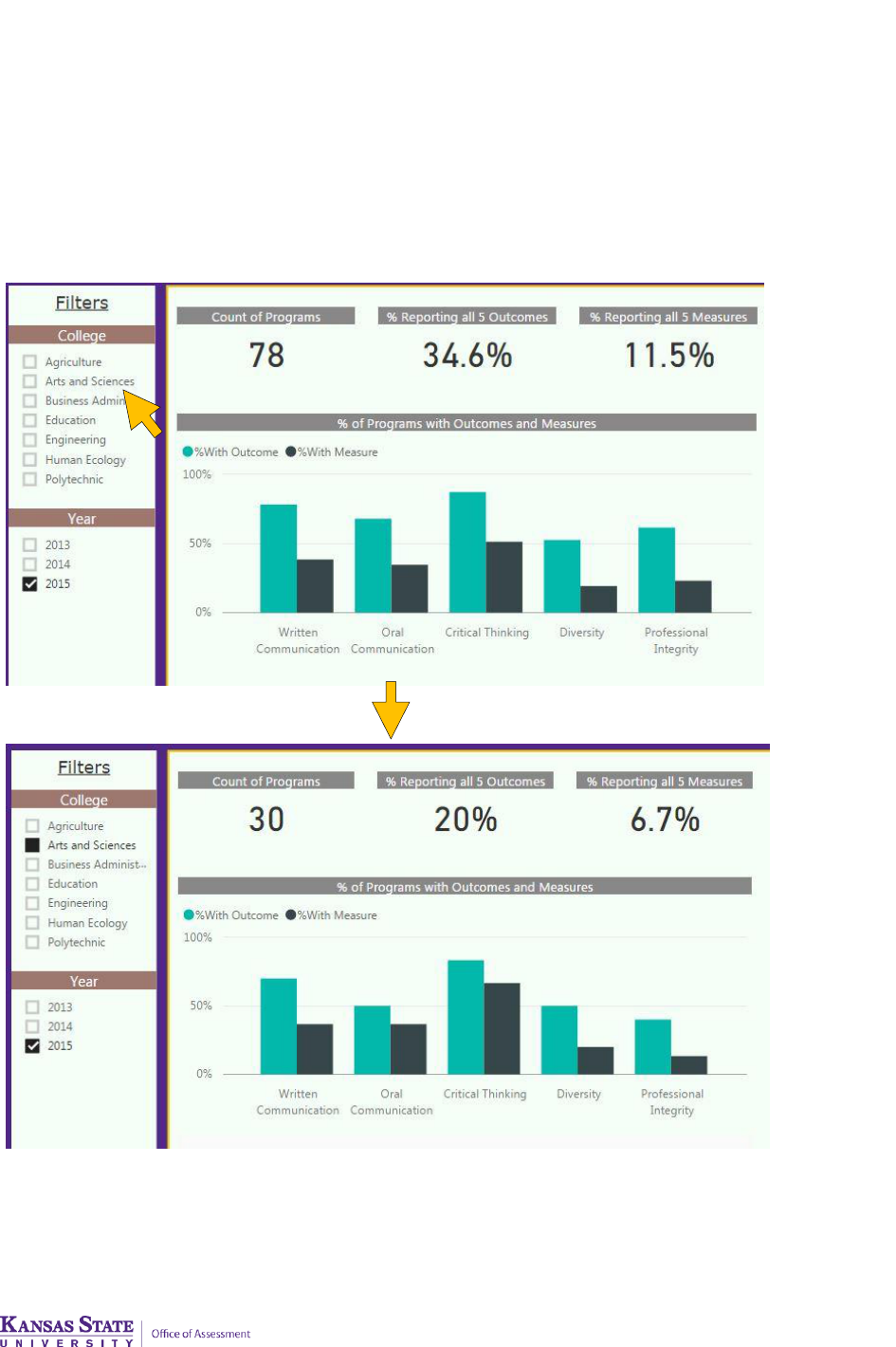
Interact with filters/slicers
Filters/slicers allow you to narrow the data that is visualized on a page. Unlike cross-
highlighting, multiple filters can be selected to narrow down the dataset. Cross-
highlighting can be used in conjunction with filters. To remove a filter, deselect all
filtered values.
Example: All colleges are initially shown for 2015. Selecting a College causes the
visualizations to show only data for that college.

Last Updated: 8/2/2016 3 of 5
Cross-highlight the related visualizations in a Report
The visualizations on a single report page may be "connected" to each other. What this
means is that if you select one or more values in one visualization, other visualizations
will change based on that selection.
Example: Clicking Male in the chart on the left causes the chart on the right to show
Male results by Ethnic Group.
NOTE: To select more than one element in a visualization, hold down the CTRL key.

Last Updated: 8/2/2016 4 of 5
Hover over a visual to see details.
Move your cursor over any visual element to view detailed data.
Sort the data in a visualization
Select the ellipses (...) to open the options menu, then click Sort by. Click again to
switch between ascending and descending.

Last Updated: 8/2/2016 5 of 5
Export the data presented in a visual (if available)
Select the ellipses (...) to open the options menu, then click Export data. The resulting
.csv file will contain all the data presented in a visual, and will respect any filters applied
to the data.
